
YOU’VE BEEN GIVEN THE GREEN LIGHT! WELCOME TO MY WORK.
GoDaddy
2021 (12 weeks) / Product Designer
CHALLENGE
According to CX research conducted by GoDaddy in Februrary 2021, users recognize that premium domains are “a lot more expensive” but don’t know why. 30% of users think the way domains are currently priced on GoDaddy.com is deceptive.
How can we provide clarity on our domain pricing and ownership so users consider purchasing a more expensive domain?
By fixing this problem, we can help GoDaddy’s business to 01) increase overall domain purchases, 02) increase premium domain purchases, and 03) reduce complaints/calls to customer care.
TEAM
Jyothiprakash Trishuleshwar (PM)
Ryan Allen (Design Manager)
Adam Sandoval (Visual Design)
SKILLS
Product Thinking
User Research
Visual Design
CONTRIBUTIONS
→ Refreshed interaction and visual design patterns
→ Defined requirements with product to guide solution
→ Ran user research to validate solution
→ Collaborated with copywriter to update descriptions
→ QA session with developers
FINAL PRODUCT
01 CONTEXT WITHIN THE PROBLEM SPACE
What is a premium domain?
There are two types of premium domains: Registry and Aftermarket.
01 Registry premium domains
are unowned domain names that have a high prescribed value by a partner domain registry.
02 Aftermarket premium domains
are domain names that are already owned and registered by someone else.
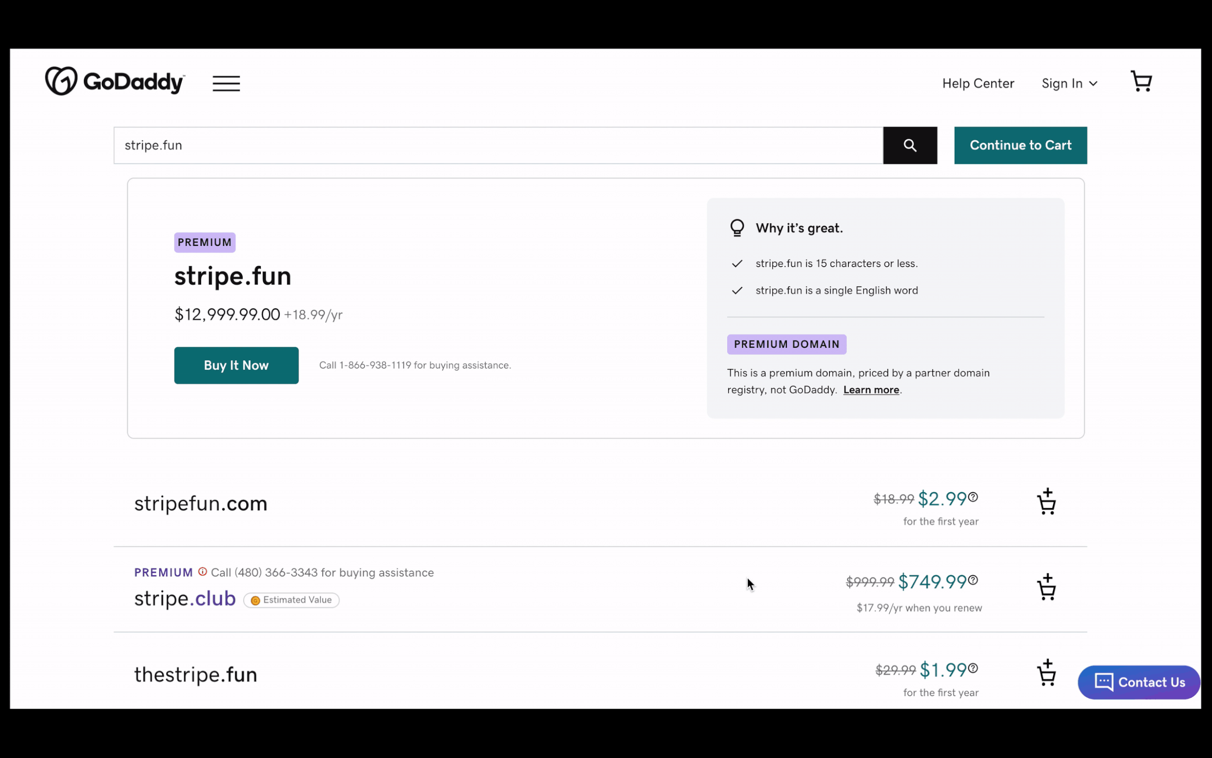
A premium domain is a domain that is identified as a short, catchy and memorable name that is likely to attract site traffic🚦
Is this a problem we need to dive into if there’s already a design there…
How do we show premium domains currently on GoDaddy.com?
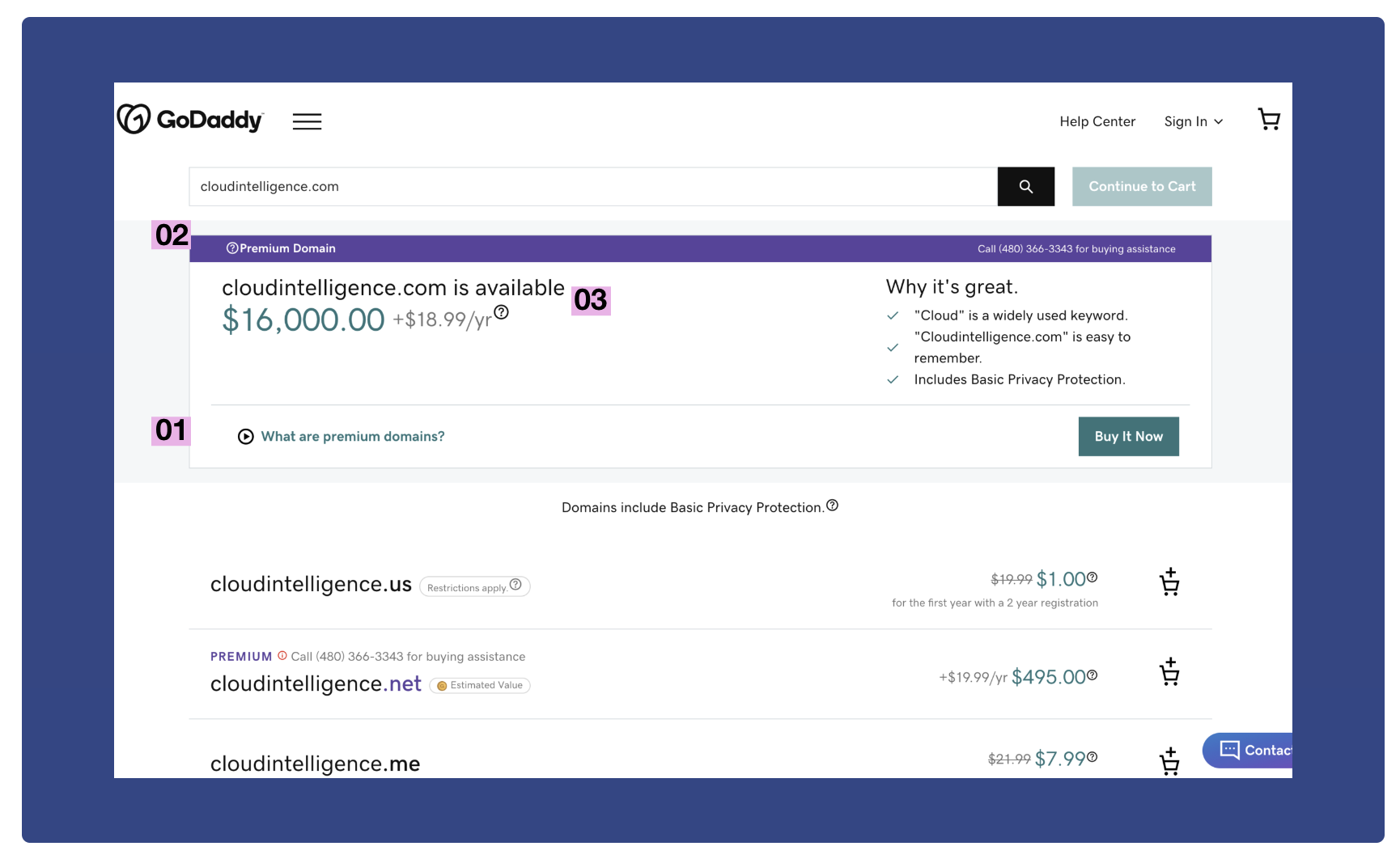
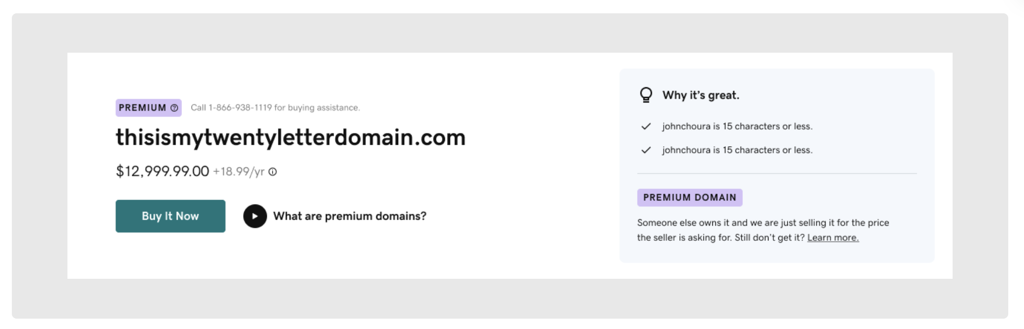
Currently, GoDaddy does not differentiate between the two different types of premium domains. When a premium domain is searched for, the top result displays the domain with three explanatory points of information:
02 RESEARCH
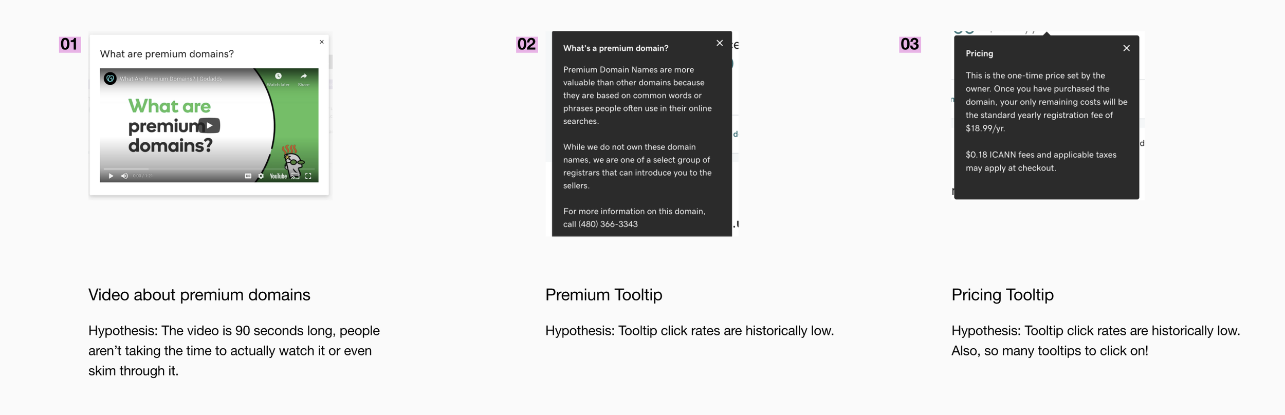
So, is the problem that no one is clicking on the information we’re providing?
Let’s confirm this hypothesis with research using 5 Unmoderated User Research Sessions on UserTesting.Com 👩🏽🔬
-
1. Tell us have you ever purchased a domain before? If yes, how many do you have?
2. Do you know what a “premium domain” is?
3. You have been taken to a new page. When you see the page, move on to the next step.
4. Look for the domain name “summer.store”. Stop when you see the results page load and click next when you are ready for the next task.
5. Do not click on anything just yet. What do you notice about summer.store? What information do you understand regarding the domain’s pricing?
6. Who owns the domain summer.store? Please share out loud your process in finding this information.
7. Why do you think different domains on this page have varying prices? Explain
8. Now type in “summer.me” into the search bar.
9. Is there anything different about this domain’s price and renewal? Explain.
10. Who owns the domain summer.me? Please share out loud your process in finding this information.
11. There is a link for “What are Premium domains?” The link will take you to a video. Please watch the short video and give us your feedback. Is the content clear?
12. Scroll down the rest of the page. If you had to pick one domain name to buy for your company from this page, which domain would you pick and why?
13. We are trying to improve how we show and explain premium domains. Do you have any advice for how we can improve?
I used UserTesting.com to run 5 unmoderated usability testing and user research sessions, asking the participants to complete various tasks on the website and gauging their understanding of premium domains.
The key takeaways confirmed my hypothesis
01
Prior to visiting GoDaddy.com, users don’t know what premium domains are. Assumptions are close but not close enough.
02
Users are assuming they understand what premium domains are without confirming assumptions.
03
Users are incorrectly assuming how prices are set are given little information to find who owns domains.
04
Watching the “What Are Premium Domains?” video gives users clarity. But, no one is clicking on this video (unless prompted to).
Knowing all this, let’s reassess the product’s design requirements ↪️
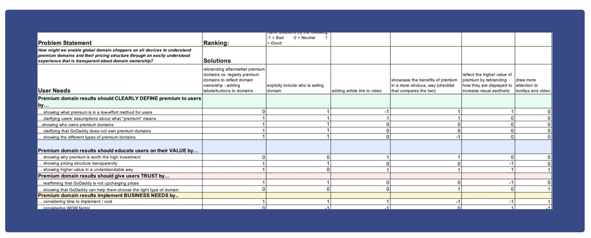
I decided to re-sort and re-evaluate using a User Needs Calculator as this new information was available.
I shared my findings from the research with the PM and lead UX designer. Together we brainstormed some solutions. I took those brainstormed ideas to a User Needs Calculator to figure out where I wanted to head next to solution. This method helped me to see what solutions best fit the users’ needs.
03 ITERATE AND TEST
Updating using our design system & copywriting
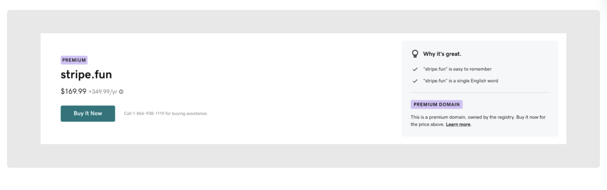
Iteration 1 uses the newly created design system.
This updates premium to the current visual standard, modernizing GoDaddy’s legacy brand. The intention behind this design is to clearly divide through the layout: “what are you buying” from “why is it worth it”.
A key addition is adding the description under the Premium Domain label in the bottom right, to reveal information right away instead of hiding it behind tooltips and videos.
Iteration 2 decreases the amount of click points.
The premium tooltip and video links are removed to allow for less clicks from the user, which was one of the goals of the redesign. This decreases the overwhelmingness of the first iteration.
Consulting with a copywriter on how GoDaddy normally refers to terminology, I also changed the copy to include more specific words about the domain registry.
5 sessions of usability testing on UserTesting.com later confirmed that the layout was working.
This round of testing highlighted the need for the copy to be very specific in stating that domains are not owned by GoDaddy. Additionally, I realized the importance of using layman’s terms when describing subjects people may be unfamiliar with. The term “registry” threw people off.
Importantly, though, the design confirmed that the new design’s purpose was being served. People had an increased understanding of what a domain was and why a premium domain might be important.
The shipped designs differentiate between a premium and aftermarket domain.
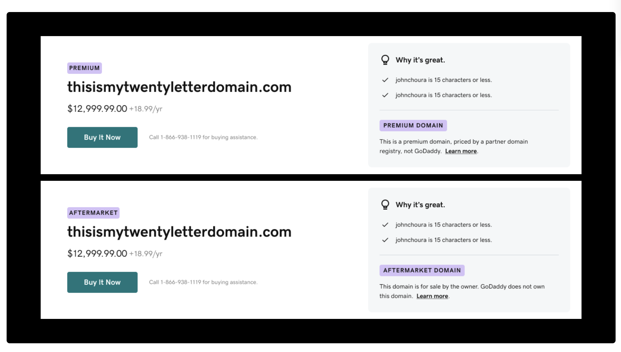
The definition given under the purple label provides low effort, high impact information for users. It clarifies that GoDaddy does not own the domain while providing transparency on pricing and ownership.
Worded in layman’s terms, all customers regardless of prior domain knowledge will be able to understand.
Why did we decide to use a modal?

All the prior tooltip information is contained in one click, now as a modal when “Learn More” is clicked.
After some iteration, consideration of development, and discussion, we landed at an explanatory modal. A modal made the most sense because…
01 Tooltips and modals expend a similar amount of engineering effort
02 Modals have the bandwidth to be elaborated on with more components
03 Going from a “Learn More” link to a tooltip is an uncommon UX practice and would be confusing
Reflection
This summer was full of learning as it was my first opportunity to work closely with a product team. I was able to experience firsthand how designs become implemented and shipped. I learned a lot about my strengths as a designer- being able to work cross-collaboratively, thinking critically, and staying organized. I also discovered my largest area of growth is visual design.
I found that I love the puzzle of product design and the collaboration it invites. I was pushed by my manager to have autonomy over my project by leading research, iterations, and reaching out to the team for help/feedback.
Huge thanks to the people below for being my cheerleaders this summer:
Ryan Allen (manager), Shriya Hardikar (mentor), Kelsey Dietrich (mentor)